|
|
Massimo Vignelli. THE VIGNELLI CANON. — Baden ; London, 2010 THE VIGNELLI CANON / Massimo Vignelli. — Baden : Lars Müller ; London : Springer, 2010. — 96 p., ill.Introduction
At the request of the publisher of this book I started to look in to the meaning of such a publication and recognized that it could become a useful instrument for a better understanding of typography in Graphic Design. This little book reveals our guidelines - those set by ourselves for ourselves.
In several teaching situations I remarked the lack of some basic typographic principles in young designers. I thought that it might be useful to pass some of my professional knowledge around, with the hope of improving their design skills.
Creativity needs the support of knowledge to be able to perform at its best.
It is not the intention of this little book to stifle creativity or to reduce it to a bunch of rules.
It is not the formula that prevents good design from happening but lack of knowledge of the complexity of the Design profession. It’s up to the brain to use the proper formula to achieve the desired result.
With great pleasure I look back to all the moments when I learned something new in typography, either from a Master or from fellow practitioners. To have learned about disciplined design from my Swiss fellows, to have learned about the white space from my American fellows, to have learned about the forceful impact of type from my German fellows, to have learned about wit from my English fellows, and then even more from fellows everywhere.
That beautiful feeling of enrichment that comes from new discoveries, new ways of doing the same thing better than before.
It is my hope that this book may provide that feeling, or in any case confirm and reaffirm those guidelines that we designers love to set for ourselves.
[Contents]
Introduction
Part One. The Intangibles
Semantics
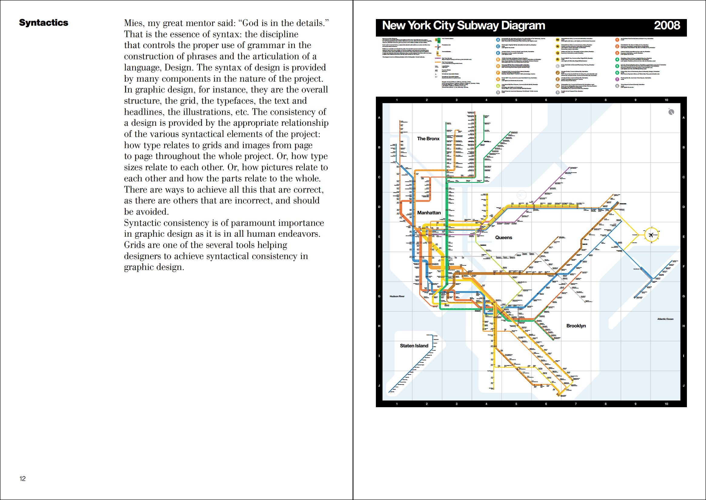
Syntactics
Pragmatics
Discipline
Appropriateness
Ambiguity
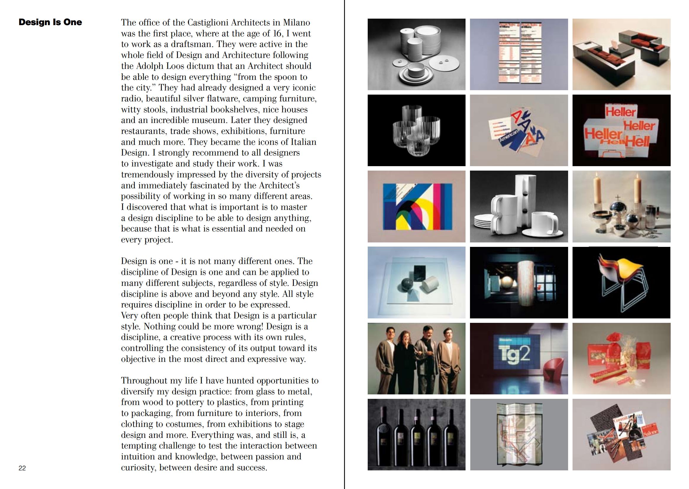
Design is One
Visual Power
Intellectual Elegance
Timelessness
Responsibility
Equity
Part Two. The Tangibles
Paper Sizes
Grids, Margins, Columns and Modules
A Company Letterhead
Grids for Books
Typefaces, The Basic Ones
Flush left, centered, justified
Type Size Relationships
Rulers
Contrasting Type Sizes
Scale
Texture
Color
Layouts
Sequence
Binding
Indentity and Diversity
White Space
A collection of experiences
Conclusion
Sample pages 
Direct download link (pdf; 3,9 MB)
17 июня 2022, 20:51
0 комментариев
|
Партнёры
|


Комментарии
Добавить комментарий